My plan is going to be slightly different from this copy of a college magazine cover. On the other hand I am planning to keep authentic features such and a large masthead and a figure in the middle of the magazine. Furthermore I am willing to use this shade of red (shown in the image on the right) so that it stands out and legible to read. I like the way they have done this. The headlines are also easy to read as the black writing works well against the white background. It stands out for the reader to read. The person on the front cover of this magazine is also wearing a purple coloured top which could connote royalty about the college. Furthermore suggesting elegance and sophistication about the college. The person is also smiling giving positive body language about the college with her clean white teeth and healthy smile. Moreover she is directly looking at the audience, this could connote thats she is trying to draw attention to the reader so they look directly back at her.
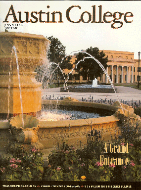
This college magazine is based in the United States. Austin College is shown on the front cover of a very 'upper-middle class' image of the college. The masthead of the college is very simple but on the other hand the colour is very warm and fits perfectly with the setting. The weather is calm and relaxed which could appeal to the audience that it is a nice place to be. Even though this is a college magazine. It really do not appeal to the younger generation which will most proberly be attending this place. It is not very authentic also which also might grap the readers attention.
http://www.grimsby.ac.uk/documents/GX_mag/GX1.pdf
The GX Magazine is seen as a very vibrant magazine which would definatly appeal to younger people. The magazine name is very large to grasp the attention of it's audience. The characters used on the front cover of this magazine are quite 'animated' which could also possibly connote why it is maybe aimed at the younger generation. On the other hand I dislike the usage of blue as the cover lines. They seem lost because of the distration of the background above. I do like the use of anchorage on this magazine which says' the word on the street'. Again this is aimed and more associated with the younger generation. The photo used on the bottom right of the magazine looks out of place and does not really combine with the 'cartoony' feel of the front cover, more to the point is far to small to have on the front cover which will not appeal to the audience
No comments:
Post a Comment