
Thursday, 9 December 2010
Wednesday, 8 December 2010

Tuesday, 7 December 2010

Monday, 6 December 2010
LIIAR interpretation of the brief
I am going to do a LIIAR interpretation of the brief to show what conventions I should have used in Feedback Magazine. The conventions I will use will initially will be placed in language.
Language:
-A masthead which is used to stand out and attract the readers attention, this is also authentic because a masthead will stereotypically appear on a music magazine in a bold, bright fashion.
-Anchorage is also used to drag the reader in to read more, this could be used as a slogan to create a connotation. This also can be the picture used which can be related to the issue.
- A caption can also be used to tell the audience more about the picture used, why it is related to the picture. An insight of what will pop up as the reader progresses through the magazine so they know what will come up.
-A logo will be used to stick in the audience's head. So as the logo is advertised the audience can refer to the magazine.
-Issue dating and listing will be an important convention to tell the audience that this is the up-to-date issue. This also allows them to carry on from the last issue.
-House styling and colours will be another important factor so the magazine does not look too messy and lost with a wide variety of house styles and colours. To keep it original a limited used of house styles and colours will be used to keep authenticity.
- A headline will also be used to tell the audience what the main image is about as it will be the main issue in the magazine.
Institution:
The music magazine publisher that Feedback Magazine will be published under is by MusicMags Magazine Distribution as they generally produce classic rock or any other type of rock magazine. This will be ideal for Feedback Magazine as it is a classic rock magazine. Some magazines will will be similar to 'Feedback Magazine' and published by MusicMags magazine distributor consist of 'Guitar Player Magazine', 'Guitar World', and 'Bass Player'. These are very popular magazine amongst rock fans. MusicMags Magazine Distribution also have there own website which is http://www.musicmags.net/.
Ideology:
The morals and hidden and opinions I want the reader to pick up upon is a slight rebellious nature about the magazine. Although Feedback Magazine will initially be aimed at the 35-55 age catagory. It might make them reminisce about their past of rebellious youth.
Audience:
The audience is a major factor of selling a music magazine. There has got to be a high percentage of people in the classic rock fan community in order to sell 'Feedback Magazine'. I have chosen my target audience by using demographics to narrow down what age group I am specifically aiming 'Feedback Magazine' at. This is how the demographics are catagorised:
-Male/Female
-Under 15
-15-24
-24-35
-35-55
-55 and over
The catagory that 'Feedback Magazine' will be placed under is 35-55. This is because classic rock music was extremly popular during the young lives of these people now. It would of been the music that they grew up to. On the other hand I am not under this age catagory which can contradict the catagory that I have placed my magazine under. Socio-economoic Groups (SEG) is also another way of categorizing 'Feedback Magazine'. This consists of the money in which the target audience earn, social class and occupation of the audience. These are the six different catagories which magazines can be placed in:
A - These are the highest earning jobs with high income which are high managerial, administrative or proffesional jobs.
B - Lower managerial jobs, administrative or proffesional.
C1- High skilled manual workers
C2- Semi-skilled manual workers
D- Semi-skilled and unskilled manual workers
E- Unemployed, Disabled, Pensioners
Another way to classify audiences is to value life styles (VALS). This is done using physcographics and consist of four main catagories. These are sub-divided into lifestyles.
1. Groups driven by needs such as survival
2 Groups who are outer directed - belongers, emulators, and achievers
3. Groups who are inner directed, i-am-me, experimentals, societally conscious
4. Groups who are both outer and inner directed-intergrated.
Representation:
My magazine will feature a positive representation so that it interests more types of people to buy the magazine. On the other hand I am going to use a slight negative and stereotypical representation as rock music generally has rebellious nature included as part of the lifestyle associated with the music.
Saturday, 4 December 2010
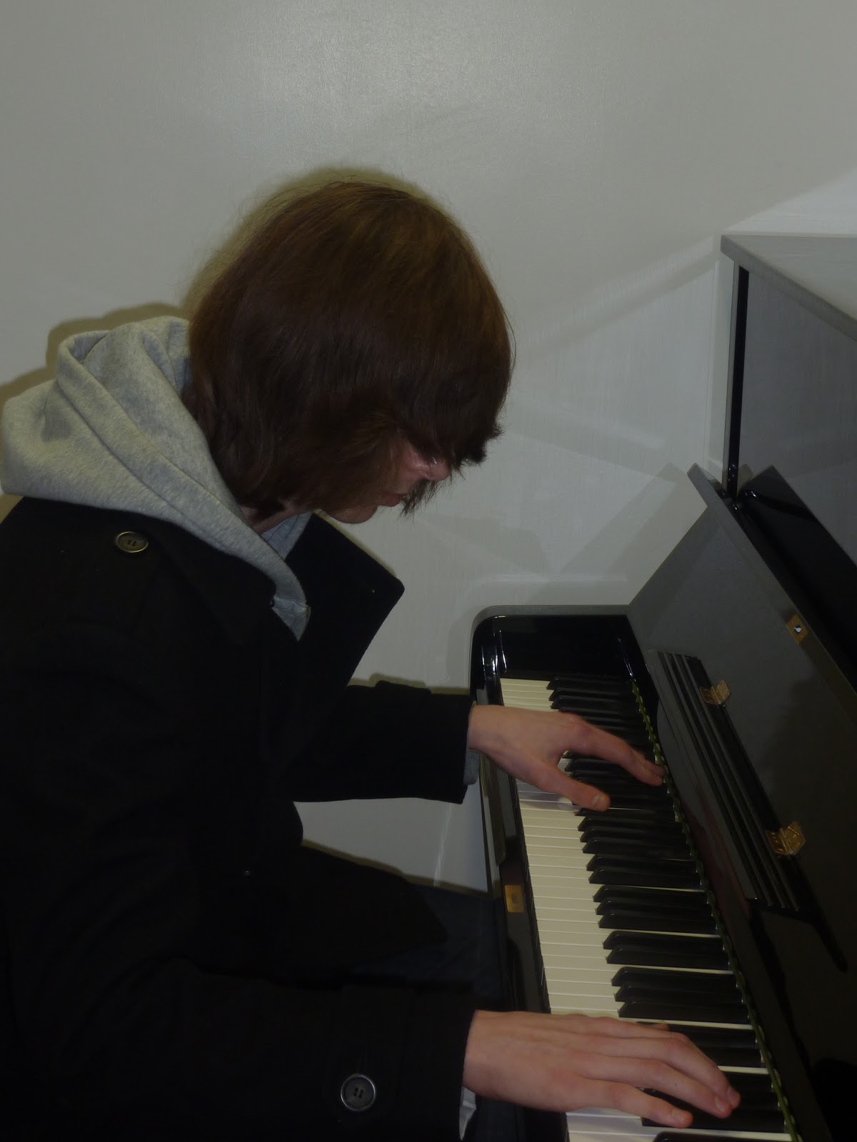
Pictures For Feedback Magazine


Thursday, 25 November 2010

Wednesday, 24 November 2010
Price of 'Feedback Magazine'
My magazine will generally be aimed at all social classes but mainly at the working classes as my magazine will try to thrive people from working class backgrounds to achieve their dreams. Therefore will be aimed at the socio-economic group of D. As my magazine will be aimed at this group my magazine will be realatively cheap at the price of £2.50 to allow these groups to afford the magazine. Other magazines such as 'Classic Rock Magazine' is usually around the price of £7.99 for a standered issue. This means my magazinine will be at a cheaper price as it allows merely all socio-economic groups to buy 'Feedback Magazine'.
Main Task Briefing
The things I am going to do is create a front cover, contents page and an article which will consist of a double page. All images will be taken by me, at least four minimum. To keep authenticity I will use my own house style and text
Tuesday, 23 November 2010
Possible names for my magazine
- Feedback
- Distortion
- Curley Lead Magazine
- Devil's Thorns
- Treble Boost...
- Rock of Ages Mag
- Bring Back Rock n'Roll
- Medley Magazine
- Lick
Monday, 22 November 2010
First Brief Planning
Firstly I am planning on using to use few house style colours as my last project I feel was slightly muddled. My main colour will be black as I feel this is authentic and is related to rock. On the issue of rock my magazine will be related to classic rock entitled 'Feedback' named after the literal electric feedback which guitarists can achieve when playing. I am also going to have the have the 'back' of 'feedback' backwards so that it looks creative and effective. All pictures will be of me and of colleagues that are in my class to show originality. The image will go above the masthead so the full image of the mid shot is shown. The picture will be a picture of me looking in to the camara holding an electric guitar with no expression shown to show the seriousness of the magazine, it will also make the figure look iconic. The strapline will consist of 'Rock n' Noel', an interview with Noel Gallagher interviewed by 'Feedback Magazine's editor Ben Farr.
Monday, 15 November 2010
Music Magazine Research
 L- The camara shot shows some few iconic guitarists over generations, the main icon shows Jimi Hendrix with other guitarists next to him connoting that he is the best because he is the larger image. All shots of the guitarists shown are all mid shots. The key house styles of the magazine is the colour orange, white and black. The colour orange can connote fire in which Jimi Hendrix is iconic for. Jimi Hendrix's hand can also be seen as anchorage on the magazine as it shows a sense of direction to the audience with his hands illustrating the audience to look inside.
I -This magazine is aimed people who specifically enjoy classic rock music. The picture shown on the front cover is extremly relavent because of the classic 60's vibe which is relevent with the genre.
I - The moral of this magazine highlights that the magazine issue is iconic towards the targeted audience representing the most charasmatic guitarists of all time in this issue. It encourages and makes the audience want to be like this be the figures seen on the front cover are seen as some of the greats.
A - The target audience of this magazine is aimed at 35-55 year old people because classic rock was the music which was occuring at the time this specific age group was younger and may recall their passion of their rebellious past.
R - This magazine can be seen as stereotypical, highlighting that the magazine issues is about free spirit, sense of carelessness which is shown on the front cover of the magazine. This highlights how the genre of the music affects the person in this way which the audience like.

L- The masthead of 'This is Rock Magazine' emphasise that the genre of the the music magazine is about rock because of the stricking upper case letters of the word 'rock'. The house style of the magazine is very simple but effective as the the black background can can relate to the figure shown on the front cover on the magazine.
I - 'This is Rock Magazine' is aimed at people who are interested in the music genre 'classic rock'. AC/DC guitarist Angus Young is an iconic figure in the rock music genre.
I - The message shown on the front cover of this magazine is the passion which is seen on Angus Young's face highlighting his love for that specific music genre. Moreover the picture on the cover of the magazine shows Angus Young bare chested; which therefore connotes his masculinity.
A- The audience this magazine is aimed at is rock fans but also can be aimed at people who are interested in instruments which will most probably feature in this issue. The age catagory this magazine will fit into will most probably be 35-55 year old people because most people in that age are stereotypically interested in this genre of music.
R - The representations of this magazine can be seen as stereotypical because rock music is known for musicians to be topless onstage which this illustrates. Moreover the representations are positive because it highlights that the figure is enjoying playing the music which the audience will like.

L - This mid-shot picture is of Matt Bellamy from rock band Muse. It can be seen as very iconic as the the camara angle is facing up to him creating the feel that he is powerful and important. The masthead and bannerline of Kerrang Magazine is quite distorted which could be related to guitars as they are also distored but in a different meaning. It is informal, street which could attract specific people from the age catagory Kerrang Magazine aim at.
I - Kerrang Magazine relatively aims at 'todays' rock music and people who are interested in the alternative rock genre. This is noticable because this issue is colourful with clean, fresh, modern pictures shown on the issue.
I - The slogan 'life is loud' is in red which could connote love and passion for the magazine. This also matches with the clothes the figure Matt Bellamy is wearing. A faded banner headline is also used on the front cover to instantly grap the eye of the audience to highlight. The bold white writing is also used to empathasise the importance of the issue.
A- Kerrang Magazine usually aim their target audience at 24-35 year old people who were most probably growing teenagers during the birth of alternative music in the 1990's-2000's.
R - The representations of this magazine can be seen as positive on the cover of Kerrang Magazine because of the red connotations shown in the picture. Matt Bellamy's red jacket and trousers connote his love for playing the guitar and playing music. This can also been seen from the expression in his face. The anchorage 'life is loud' is also in red same as Matt Bellamy highlighting this is a good thing.
Friday, 22 October 2010

Completion of Kollege Magazine
This is the front cover of Kollege Magazine Completed.


This is the contents page of Kollege Magazine completed.

Thursday, 21 October 2010
Kollege Magazine evaluation
I am extremly fond of Ben's magazine. I feel his use of colours worked work well with the house style of his writing on the front cover of the magazine and also the contents. The house style fonts he used are appealing to the eye as they are bold and red which suddenly caught my eye as soon as I looked at the front cover of Ben's magazine. He uses red colouring for the font quite often which could connote 'love' implying 'love for the college'. Anchorage is also used on the front cover to grasp the readers attention, this is seen by the motto he has included which says 'aspire your desire'. The denotation of this is to achieve ones goal but the connotation behind this is to succeed at college and beyond. His magazine name is also very clever as it is extremly aimed at the younger generation as this letter change is used quite frequently to create a 'hip' affect of the magazine. I thought this style of font worked best with the magazine, there was also other fonts he was planning to use but didn't feel they would suit the magazine. The lay-out is in a very simplistic way so the reader can easily understand it, this is due to who it's aimed at. It is aimed at all ages including students and even staff.
The photo's of the student on Ben's front cover (me) shows the student revising setting a good and encouraging example to other fellow students. It is a full shot of the student so the audience know how he is revising. Moreover on the contents page the student is seen on the right of the page with his eyes facing the contents listings. This is to direct the reader to look at the contents listing. The other two spare photos Ben took were unused as he felt they would look out of place in which I also agreed. The photos are also in black and white which gives an air of mystery about the magazine.
To keep the magazine striking and authentic it can also be seen that Ben has used the 'Wyke College' logo to show who the magazine is aimed at. Moreover he uses a bar code on the front cover of his magazine to make it authentic so it gives that magazine feel about it. The coverlines used on the contents are also relevent with student life as they are revolved around it. Moreover it is easy to identify the main headline of the magazine as it is in bold and covers the bottom of the page. I also thought the editors note was very clever as it gives the reader an insight of what the main issue will be about in the magazine. This usually appears in many magazines.
In conclusion I think that Ben's magazine is very professional and attractive towards the audience. It looks like a typical magazine with similar features. It is certaintly a magazine me or anybody else would definatly purchase!
By Lindsey Simpson
Wednesday, 20 October 2010
'Kollege Magazine Pics'
These are some of the pictures that initially intended to include in my magazine and also the front cover.

I liked this picture as it shows what the student is doing which is studying, an important factor of college which I wanted to show on my front cover.

I also used this photo in my contents facing away from the audience, I also rotated the picture so that the person in the picture was looking at the contents listing directing the audience to read it.

These are my other two spare pictures I took but unused for my magazine.

Sunday, 17 October 2010
Applying (LIIAR) to 'Kollege Magazine'
These are the 5 different areas I will include in my magazine and how it will be used:
Language - Firstly my front cover picture is going to be a long shot featuring all of the persons body. But I will take many other shots from different angles to get a variety of camara shots to choose from.
I am also going to use the green Wyke College logo so the people who buy it know what college it is related to.
I also want the picture to be black and white to create a mystery of the magazine which black and white connotates, making the audience want to read on and know what is inside the magazine.
The same font colours and style will constantly be used so the magazine does not seem muddled and so it relates to the house style of the magazine.
Institution - Kollege Magazine will be aimed at students of Wyke College. On the other hand it can also be aimed at the teachers and staff of Wyke College also.
Ideology - Morals will be hidden in my magazine in which the audience can think for themselves what is behind the message. Again this creates an air of mystery and relates to the colour of my front cover (black and white). This is to keep the reader interested. This will be seen from the motto I am going to use on the front cover of the magazine.
Audience - Kollege Magazine will be specifically aimed at people related to Wyke College. This includes students, teachers, staff and even parents to inform them what is currently occuring at Wyke and what is planned for the future. It will be aimed at all ages but most of the magazine will be aimed at 16-25 year olds including both sex.
Representation - Kollege Magazine will be humourous, entertaining and also informative to give a postive representation of the college. This is to keep the interest of all types of people. The magazine will be unbiased as possible and will also include the veiws from the students of Wyke.
Saturday, 16 October 2010
Kollege Magazine Research
http://www.google.co.uk/imgres?imgurl=http://www.jacobtyler.com/portfolio_images/CMag-covers.jpg&imgrefurl=http://www.jacobtyler.com/portfolio-print_college_magazine.php&h=344&w=416&sz=42&tbnid=uIJ1HKd4nlr1vM:&tbnh=103&tbnw=125&prev=/images%3Fq%3Dcollege%2Bmagazine&zoom=1&q=college+magazine&hl=en&usg=__rf8Q19HtI8YoEZyBEqKnsDSdg2A=&sa=X&ei=Yfe5TI3NMs294gav2en5DQ&ved=0CCYQ9QEwAA
My plan is going to be slightly different from this copy of a college magazine cover. On the other hand I am planning to keep authentic features such and a large masthead and a figure in the middle of the magazine. Furthermore I am willing to use this shade of red (shown in the image on the right) so that it stands out and legible to read. I like the way they have done this. The headlines are also easy to read as the black writing works well against the white background. It stands out for the reader to read. The person on the front cover of this magazine is also wearing a purple coloured top which could connote royalty about the college. Furthermore suggesting elegance and sophistication about the college. The person is also smiling giving positive body language about the college with her clean white teeth and healthy smile. Moreover she is directly looking at the audience, this could connote thats she is trying to draw attention to the reader so they look directly back at her.

http://www.grimsby.ac.uk/documents/GX_mag/GX1.pdf
The GX Magazine is seen as a very vibrant magazine which would definatly appeal to younger people. The magazine name is very large to grasp the attention of it's audience. The characters used on the front cover of this magazine are quite 'animated' which could also possibly connote why it is maybe aimed at the younger generation. On the other hand I dislike the usage of blue as the cover lines. They seem lost because of the distration of the background above. I do like the use of anchorage on this magazine which says' the word on the street'. Again this is aimed and more associated with the younger generation. The photo used on the bottom right of the magazine looks out of place and does not really combine with the 'cartoony' feel of the front cover, more to the point is far to small to have on the front cover which will not appeal to the audience
My plan is going to be slightly different from this copy of a college magazine cover. On the other hand I am planning to keep authentic features such and a large masthead and a figure in the middle of the magazine. Furthermore I am willing to use this shade of red (shown in the image on the right) so that it stands out and legible to read. I like the way they have done this. The headlines are also easy to read as the black writing works well against the white background. It stands out for the reader to read. The person on the front cover of this magazine is also wearing a purple coloured top which could connote royalty about the college. Furthermore suggesting elegance and sophistication about the college. The person is also smiling giving positive body language about the college with her clean white teeth and healthy smile. Moreover she is directly looking at the audience, this could connote thats she is trying to draw attention to the reader so they look directly back at her.
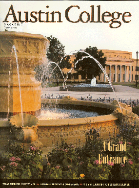
This college magazine is based in the United States. Austin College is shown on the front cover of a very 'upper-middle class' image of the college. The masthead of the college is very simple but on the other hand the colour is very warm and fits perfectly with the setting. The weather is calm and relaxed which could appeal to the audience that it is a nice place to be. Even though this is a college magazine. It really do not appeal to the younger generation which will most proberly be attending this place. It is not very authentic also which also might grap the readers attention.
http://www.grimsby.ac.uk/documents/GX_mag/GX1.pdf
The GX Magazine is seen as a very vibrant magazine which would definatly appeal to younger people. The magazine name is very large to grasp the attention of it's audience. The characters used on the front cover of this magazine are quite 'animated' which could also possibly connote why it is maybe aimed at the younger generation. On the other hand I dislike the usage of blue as the cover lines. They seem lost because of the distration of the background above. I do like the use of anchorage on this magazine which says' the word on the street'. Again this is aimed and more associated with the younger generation. The photo used on the bottom right of the magazine looks out of place and does not really combine with the 'cartoony' feel of the front cover, more to the point is far to small to have on the front cover which will not appeal to the audience
Thursday, 14 October 2010
'Kollege Magazine' Contents page lay-out plan

'Kollege Magazine' front cover lay-out plan

Monday, 4 October 2010
Planning for College Magazine
I am planning to design and publish the front cover and contents page of a magazine. These are my first ideas of what I am going to do. My front cover idea is to get a picture of me sat down reading a study book looking confused. This will be the main coverline of the magazine to help tackle the stresses of revision. The title of my magazine will either be 'Kollege', or 'College Catch-Up!'. This masthead will go under me on the front cover as the main image will cover most of the front. I am also planning to do the main cover line at the bottom right of the cover. Furthermore I am hoping to do the cover line on the right hand side and also the left hand side. I am also adding a bar code in the top left corner.
Subscribe to:
Comments (Atom)